Sierra Academy of Style
Scalable Social Content System for Consistent Marketing
A structured content system designed to improve consistency, clarify messaging, and support ongoing social media growth.
Lead Designer
November – December (2-month contract)
Illustrator, Canva, Adobe Suite
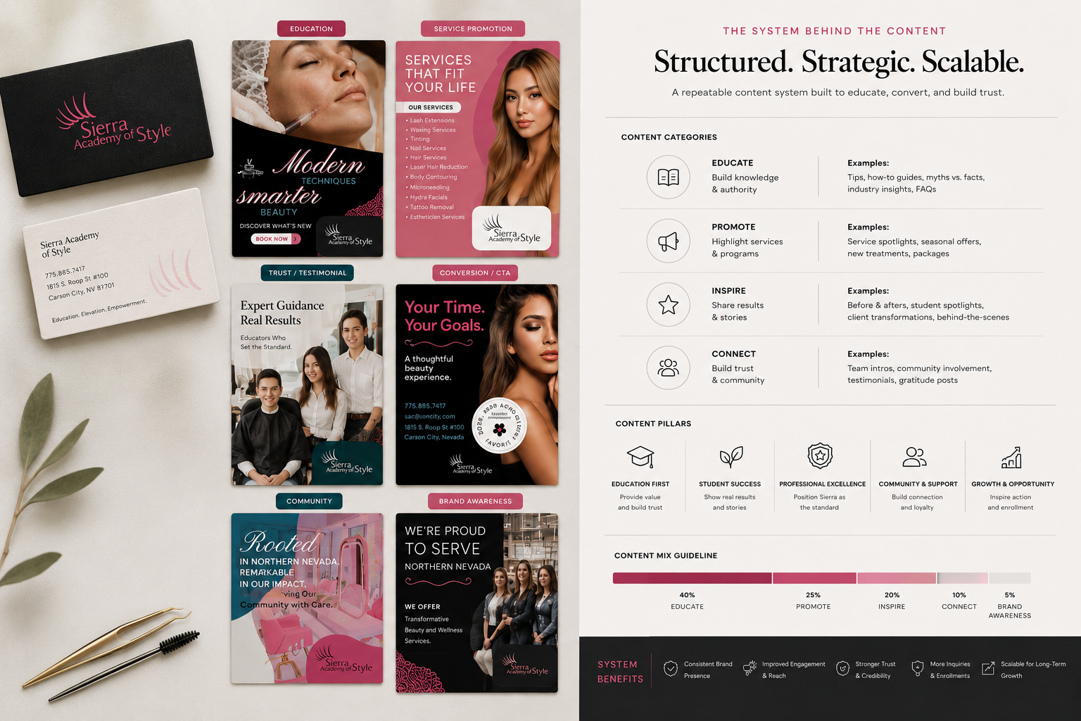
Content System Focus: Education • Promotion • Trust • Conversion • Brand Awareness
Overview
Sierra Academy of Style needed a more structured approach to social media. Their content lacked consistency, making it difficult to clearly communicate services and build trust with potential clients.
To solve this, I developed a scalable content system built around repeatable categories and visual rules. This system balanced promotional, educational, and trust-driven content while maintaining a cohesive and professional presence across all platforms.
Problem
Content lacked structure and consistency, making it difficult to scale marketing efforts or clearly communicate services.
Goal
Create a scalable content system that organizes messaging into repeatable categories while balancing education, promotion, and trust-building.
Outcome
Delivered a structured content framework that improved clarity, enabled consistent posting, and supported long-term marketing growth.
Content System Approach
- Defined a structured content system with clear categories (education, promotion, trust, conversion, awareness)
- Designed reusable templates to ensure consistency across all social media posts
- Created educational and promotional content aligned with strategic messaging goals
- Built a scalable visual framework that balances brand aesthetics with conversion-focused design
- Established layout and hierarchy rules to improve clarity and mobile readability
Content System Rules
Layout Structure
- Consistent spacing and hierarchy across all post types
- Defined zones for headline, supporting text, and call-to-action
- Optimized for mobile-first readability
Typography Use
- Clear distinction between headline and body text
- Limited type styles to maintain consistency
Color Usage
- Strategic use of accent color for calls-to-action and key messaging
- Neutral base tones to keep focus on content
Design Principles
- Clear hierarchy to guide viewer attention
- Repeatable layouts for scalability
- Strong contrast for readability
- Clean, professional aesthetic to build trust
Content System in Action
Education-Based Content
Content designed to educate potential clients, explain services, and build trust through clarity and transparency.


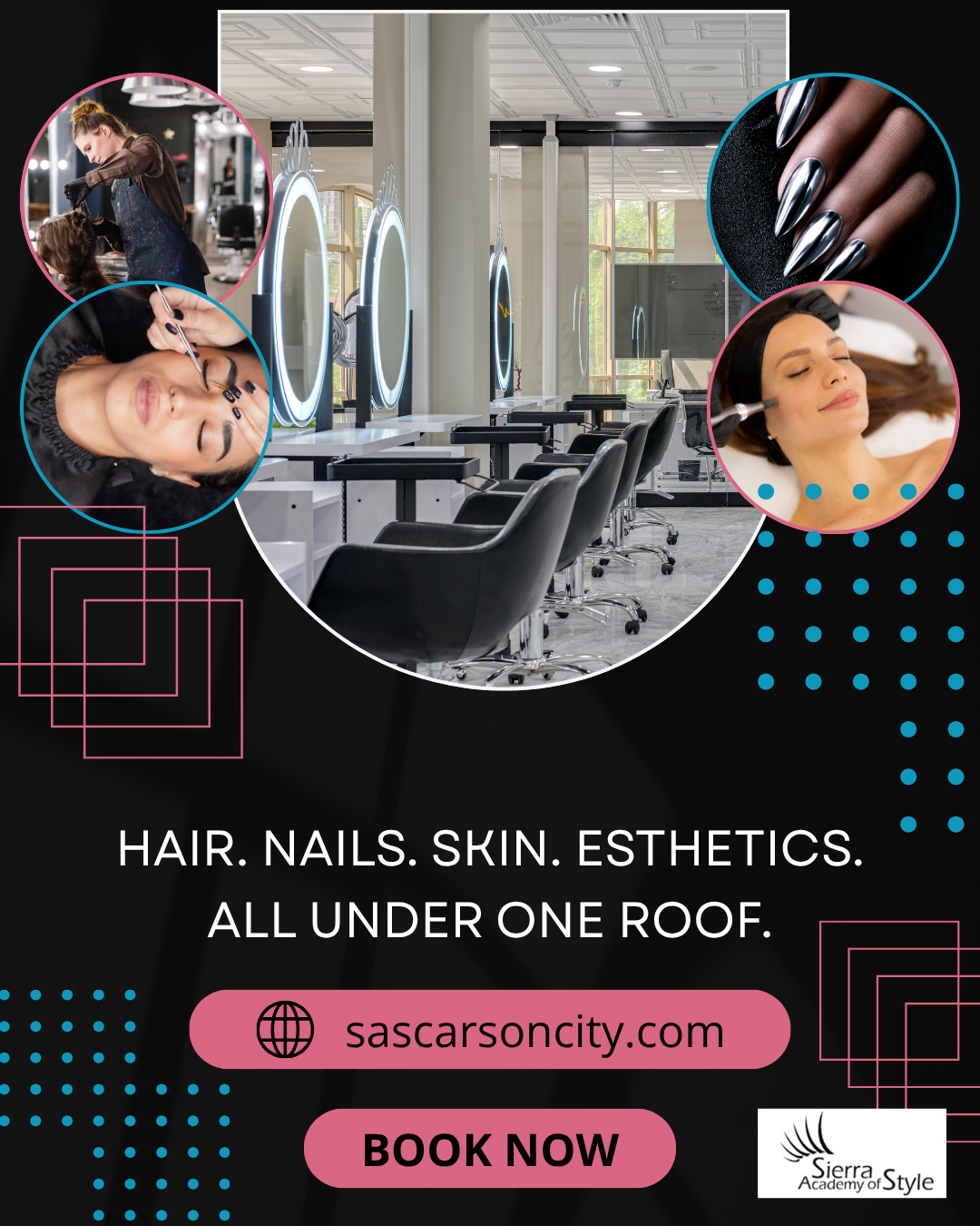
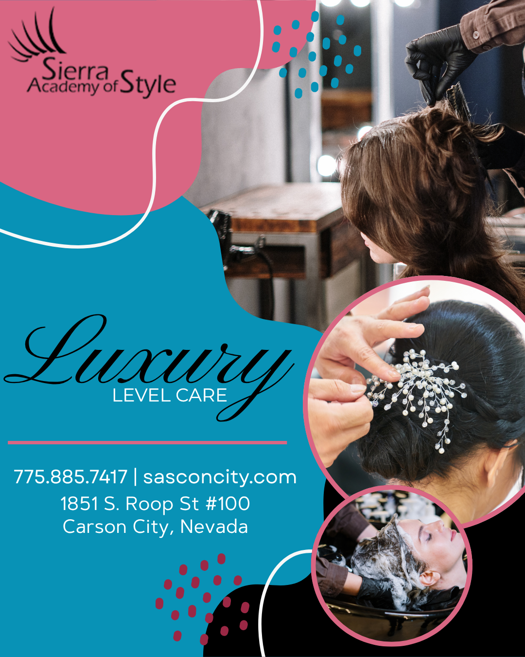
Service Promotion
Content focused on showcasing services and offerings in a visually appealing and structured way.

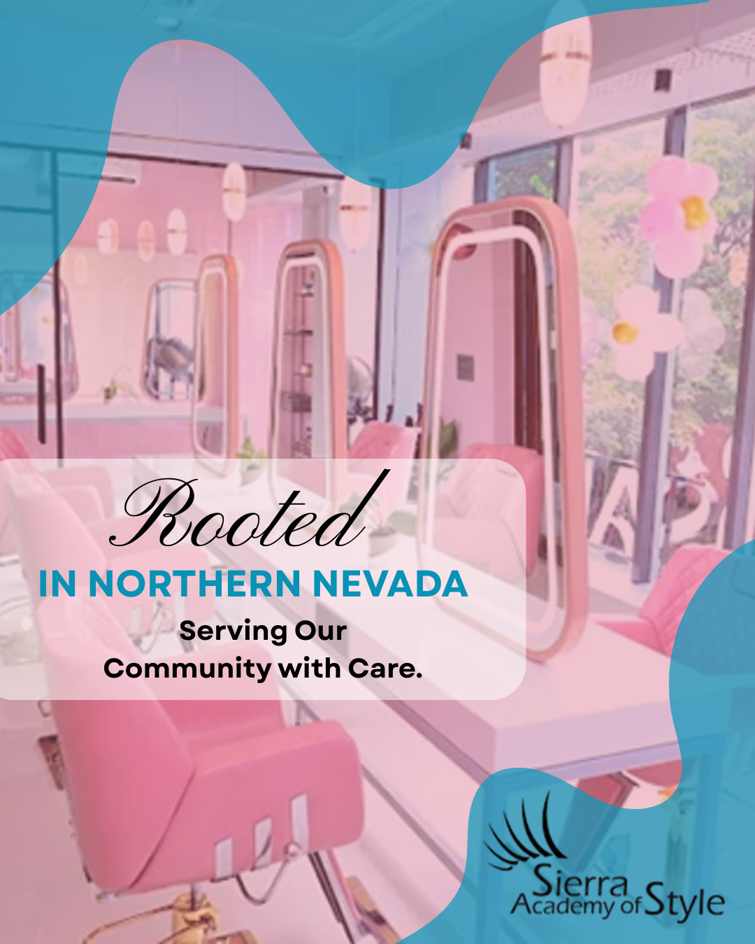
Trust & Community
Content highlighting team members, educators, and real people to build credibility and human connection.

Conversion / Call-to-Action
Content designed to drive action, such as booking appointments or contacting the business.


Brand Awareness & Lifestyle
Content that reinforces the brand's aesthetic, environment, and overall experience.


Reflection
This project reinforced the importance of building systems rather than one-off designs. Creating a structured approach to content allowed for consistency while still supporting flexibility across different types of posts.